Listings that read well
A layout that works whether a property has twenty photographs or three.
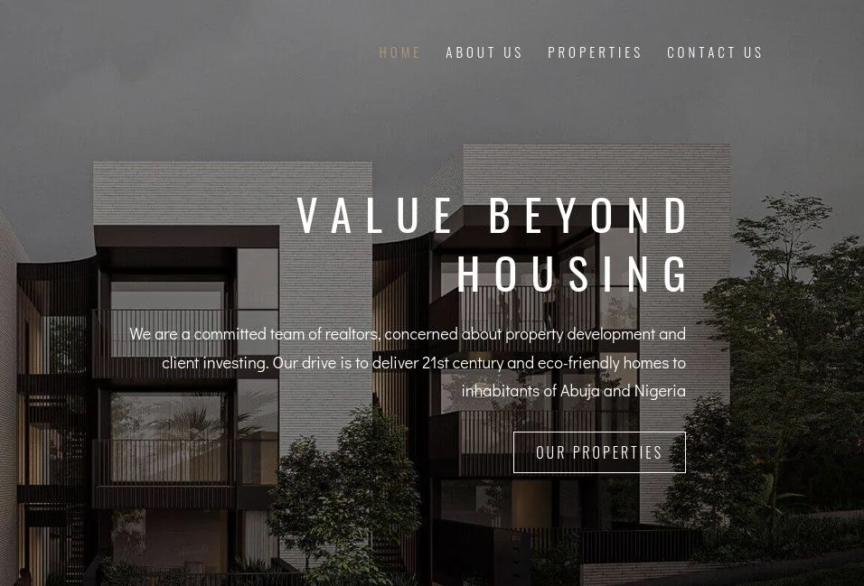
Estate agents live or die on trust. My Eya Estate needed a home on the web that felt as considered as the properties on it, where a listing could be read, believed and enquired about without a phone call first.
Property sites tend to bury the property. Listings sit behind filters, photographs are squeezed into thumbnails, and the enquiry is a form at the bottom that nobody reaches. The brief was to put the homes first and make asking about one feel like a small, easy step.
Not a logo and a landing page. A full effort across strategy, brand, content and engineering — here’s the play-by-play.
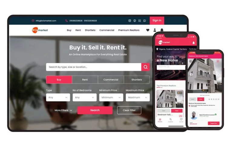
Every listing is built around its photographs at the size they deserve, with the facts a buyer actually asks for sitting beside them rather than under a tab.
Generous type, plenty of white space and a restrained palette, so nothing on the page competes with the homes it is selling.
The way to ask about a property follows you down the page, because the moment someone is interested is the moment to make it easy.
The moves that turned the brief into a result.
A layout that works whether a property has twenty photographs or three.
Listings are straightforward to add and edit, so the site stays current without us in the loop.
Most buyers arrive on a handset, so the pages are light and the images are sized for the screen they land on.
A closer look at the work as it shipped.
One project, told in full. We’ve shipped dozens more across agritech, health, media, property, commerce and platforms.
You're about to visit the live product at . It opens in a new tab, so this page stays right here for you to keep exploring.